
1
1
1
[Tazo Tea Packaging]
When conceptualizing was taking place there was new hype about Cyberpunk 2077 because of the tie-in anime that was released. The vaporwave/future aesthetic was on the mind and we try to capitalize on that social interest. At the time, Fractal had just released the Pop cases and with our great business relationship with them we were able to get a case pretty quickly. We wanted to use some vaporwave aesthetics because we felt there was a lot of overlap between vaporwave and the cyberpunk design. I believe the katakana on the glass, the framework city scape on the removable front panel, and the neon light-esque fans are just enough to convey the overall aesthetic while also not overdoing it.
Company
Tazo-School Project
Roll
[Tazo Tea Packaging]
,
YEar
2018
Collaborators
[Tazo Tea Packaging]
[Tazo Tea Packaging]
[Tazo Tea Packaging]
[Tazo Tea Packaging]
[Tazo Tea Packaging]
[Tazo Tea Packaging]
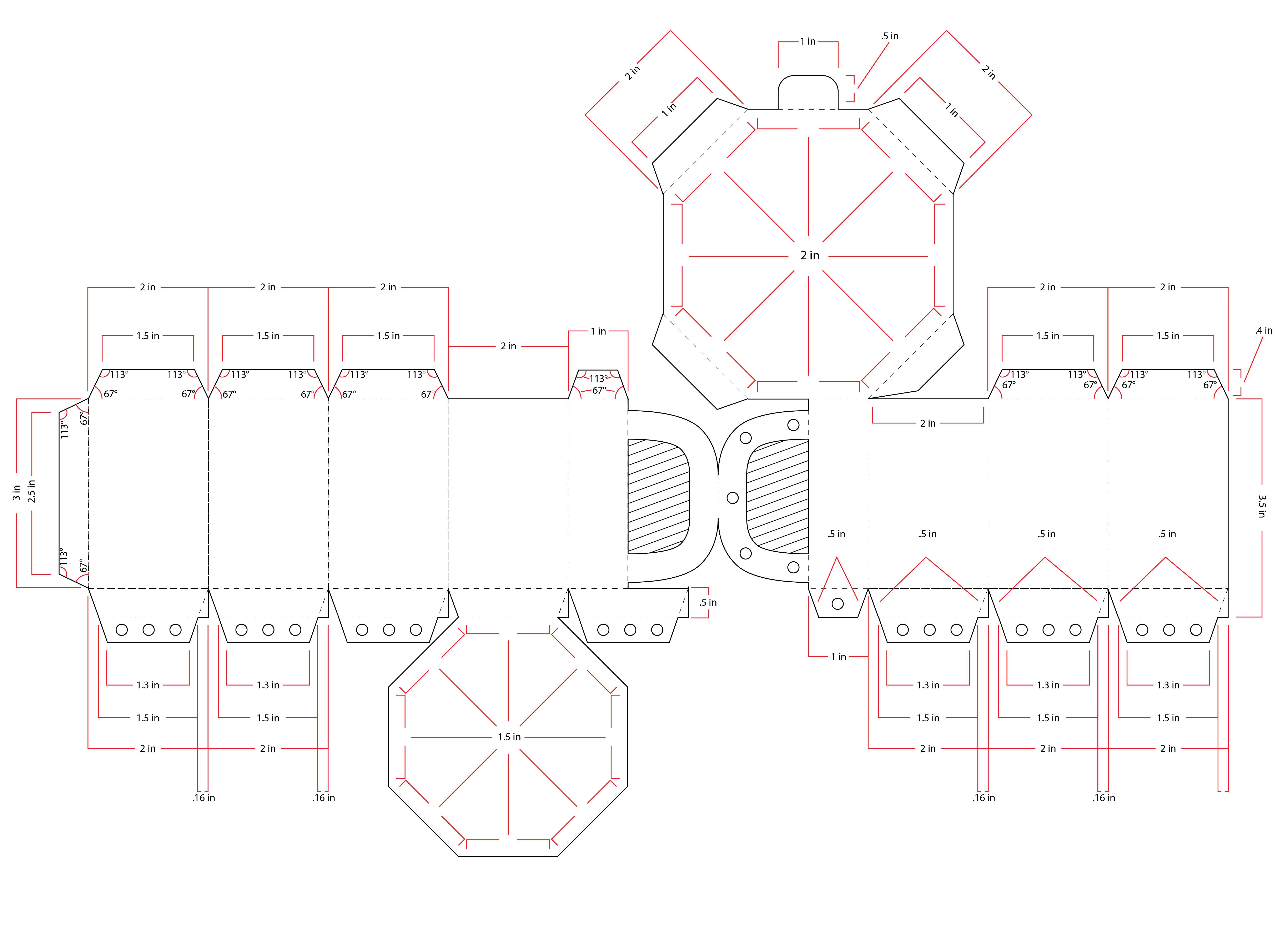
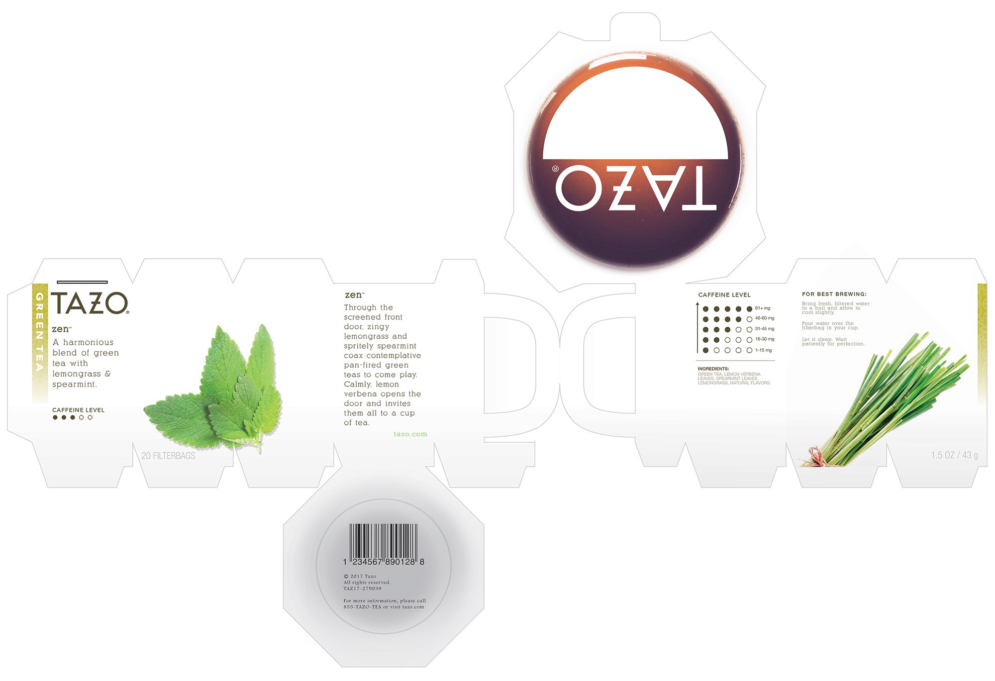
Tasked with redesigning product packaging for a school project, I wanted to break away from the standard box design. While looking up green tea packaging, I noticed nearly every photo featured small white mugs. This sparked the idea to use the mug as inspiration for the box shape itself. Using my origami background, I created a die-line that added a resealable lid and a top window to view the individual tea bags, all while keeping the necessary product information intact.
Tasked with redesigning product packaging for a school project, I wanted to break away from the standard box design. While looking up green tea packaging, I noticed nearly every photo featured small white mugs. This sparked the idea to use the mug as inspiration for the box shape itself. Using my origami background, I created a die-line that added a resealable lid and a top window to view the individual tea bags, all while keeping the necessary product information intact.
Company
Tazo-School Project
Roll
Packaging Designer
,
YEar
2018
Collaborators
John Vigil
Photography
Type
Packaging Design
